

The path least taken | Perpetual Education:006
A path opens to those who are honest.

On the last episode, I left off just before taking on the Super Responsive Layout Challenge.
That looks like more basic website layouts. Right? So if I could take the do well in this challenge, you could say I got a pretty good grasp of my current tools. Well at least enough to make a website like this.
The Setup
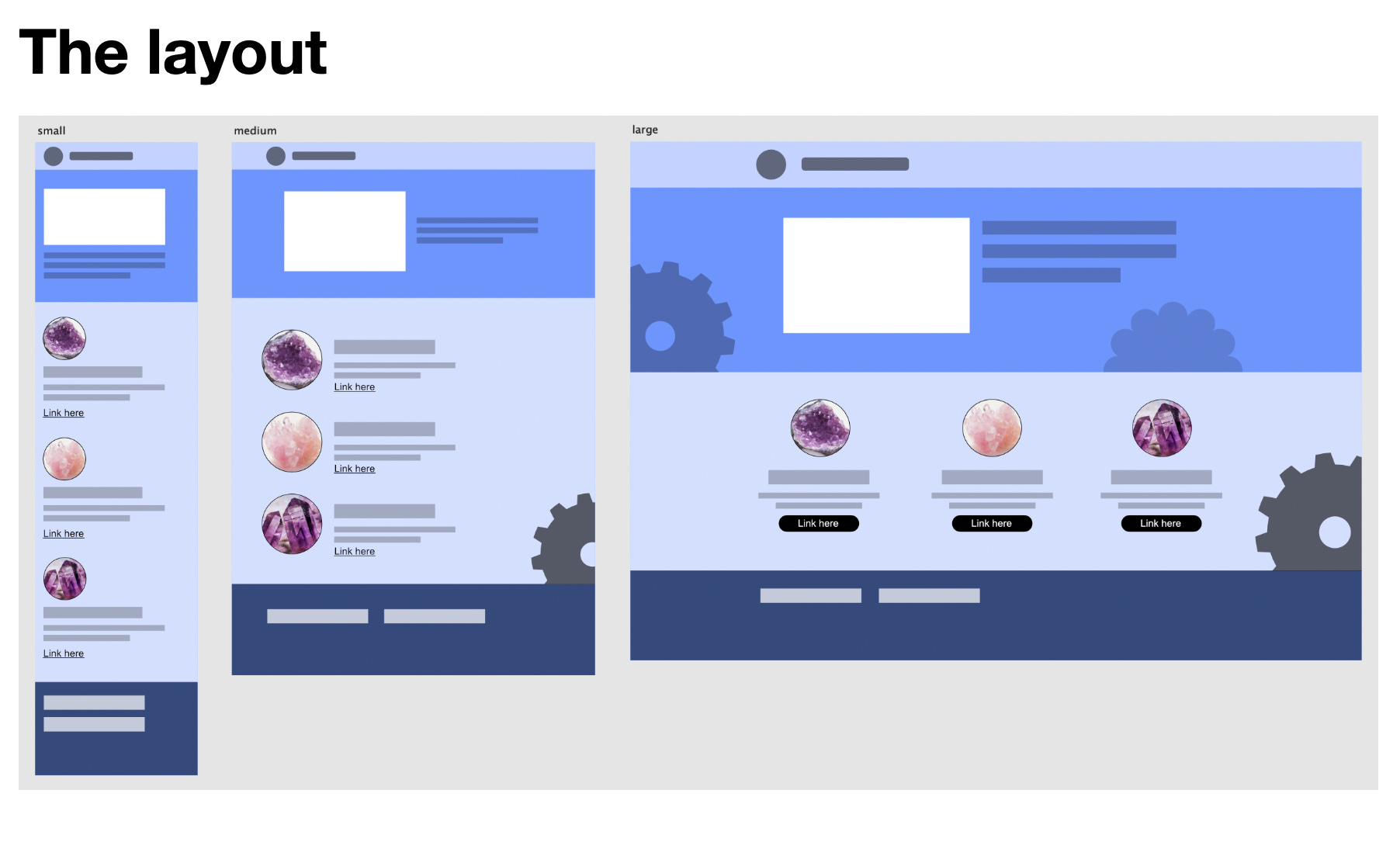
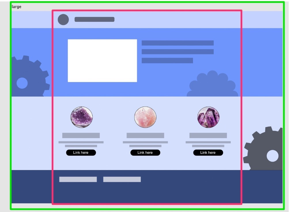
A key thing that we focused on in the past coding exercises and challenges is using an inner column to create the inner space that will contain our information. The green box would be the entire webpage but the red box is our inner column.
<main class='page-content'>
     <section>
          <inner-column>
               <picture> Cirlce Images </picture>
               <h2> Title </h2>
               <p> More details </p>
          </inner-column>
     </section>

     <section>

     </section>
</main>1This is the general idea for my page content. Each <section> represents one of the different purple areas while the <inner-column> represents the red box within those purple areas.
The whole concept was something I understood in a simple site-building exercise we did a couple of weeks ago but putting it into an actual website design was a bit of a challenge. I understood the benefit but not how to execute it. During the client project we did not too long ago, it really hammered in how to use it effectively and really opened up the idea of making and designing websites. Interesting to say that I could use it fully at first but we’ve been working through a lot of things that made it just click.
Key Take-Aways
Flexbox.
Flexbox opens up the freedom we have when creating and organizing elements.
Elements are initially block. This means they act as a box that fills the width of a page and has a certain height. This generally means that elements stack on top of each other similarly to stacking boxes, like the image on the right. Giving something display: flex;
by default organizes all the children of that parent box into a row like an image on the left. Most of the elements in the page are going to be display flex, it’s just whether we want them to stack into a column or a row.
justify-content:
align-items:
Justify follows the mainline of the flex, the row, or the column, and places thing to the right, left, center, or space between items. Align does the same but follows the secondary line, so when things are in a row this would control whether it goes to the top, bottom, or center. I make this distinction because when you change between rows and columns it can get a little confusing what does what. I can’t lie there is a little trial and error when trying to make elements go where I want them to.
Images
Images are tricky. I originally made the circles with images inside of them by placing the image as the background. There is a CSS element that automatically centers the background image inside of an element, so it made it easy to just make a circle around the center.
Yeah. Not going to be the best scenario for everything but I guess when you don’t make these Images specifically for this layout it could be a little difficult to work with them. After watching Derek’s review on the layout, I did learn how to use the images and make them a certain size so the circle goes over it nicely, but definitely a little learning curve and may need some more work with it.
Super Responsive Layout Results
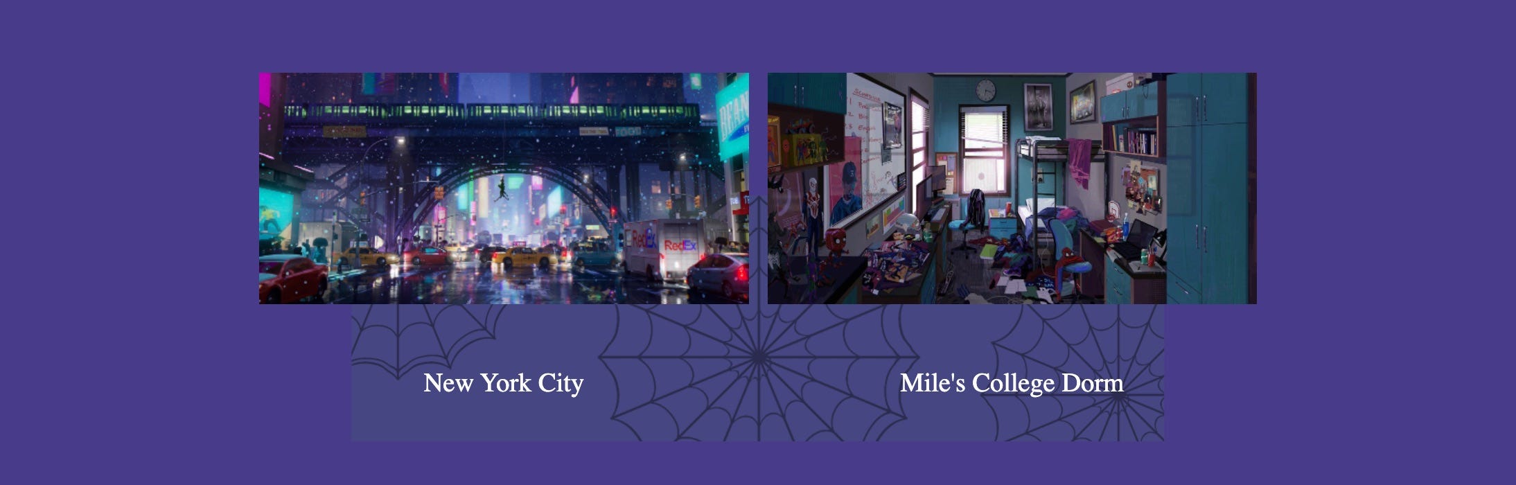
I wanted to make it a spiderman theme because why not? Live link.

Following this challenge we had a meeting with Derek and Ivy to catch up on our goals, wins/losses, and what’s next? The group has been on a “break” with no new lessons to cover but still a lot of work to get done. I think it’s a good idea just to prevent any burnout and allow an opportunity to catch up on current material or deepen the understanding of the material.
During the break this week I set some goals of organizing some files, developing some ideas, and putting things into practice.
For example, I added this section a few days ago. My discussion with Ivy and Derek showed me that this could be a good idea to example on layout and show my skills as they constantly develop. So learn a new technique = add a new layer.
This section focuses on using position: absolute; to make a box behind the images and transition: all 1s ease-in; adding some flair when the box changes shape.
You notice the box looks different in the two pictures … because it is. Well, they’re the same box but the appearance changes based on the screen size. The transition property gives it a cool little animation, I would recommend changing display size when checking out the site.
One of the resources for practice trying to find layouts in the wild and see what we could replicate. I found this!

I thought with the recent release of Overwatch 2 beta on PC, why not try to do some promo footage with this site as an example?
The results:

Took a lot of what we’ve been working on and put it all together to make this. Inner-column, flexbox, transition, position, overall layout design, and even some need things just to try out. Had a fun time trying to make it all look similar to the Morgan Stanley site but wanted it with something I’m interested in.
I took a lot of time making a landing image that changes based on the hover boxes on it. I don’t really know how to make it change and stay that way based on a click so that will have to do for now. Live link.
A lot of these projects are just work in progress ever developing.
Personal
Just wanted to take a quick second to comment on some things I enjoyed this week.
Snowfall
Season finale is this week. Overall a pretty mediocre story that has developed over the 5 seasons to something almost cartoonish. There were some strong scenes you could take from some of the episodes but at times felt silly.

This still. Oof. Really nice shot.
The final scene of the season featured “ In the Air Tonight “ by Phil Collins in the background as our main character has the world against them at this point. This song is such a cheat code for a cinematic movie feel. Such a huge build-up for a climax that starts strong and continues with perpetual energy.
Barry
Barry season 3 just started! A show asks the question is my value is determined by what I offer or who I help? Our main character is going through self-discovery and wants to do more than just what he… and many others around him would consider him to be the best at. He also happens to be a psychopath which leads to many anxiety-filled moments that make for great tv.
Alright, that was a quick right up on some things I accomplished and enjoyed this weak. I do want to make an effort to explain how things are made without making it utterly confusing. I think I’m better at talking about it to a person than writing it over a blog but that is what this blog is for, working on these skills and learning.
Till next time!
🕷
inner-column is not an HTML tag by default. It is a custom element that we make to describe to ourselves its purpose. On creation, it acts as an inline-block element.