Theme Challenge
A project Case Study.
What was the project / goal?
The goal of this project was to develop a design based on an industry of our choosing. Our purpose was to craft our CSS to fit the theme of that industry and give a professional site impression. Could we create something that starts to stray away from an amateur feel? That was the question in my mind.
The HTML layout was given to the entire cohort and required us to not touch the code. The project took inspiration from CSS Zen Garden, where every person was to take this layout and use CSS to design it based on our research.
I originally had to stop myself from editing the HTML to help fit my styling, but didn’t realize I wasn’t suppose to that make changes… yet.
Research:
First step was to collect pieces websites that I personally liked and also showed a good representation of the theme I was trying to capture. My industry of choice was sports news websites.
Some websites I had in mind:
https://bleacherreport.com/
https://www.nba.com/lakers
https://www.espn.com/
https://www.sho.com/sports
https://www.formula1.com/
I took a certain liking to Bleacher Report and NBA as they heavily influenced my style tile and further design of my website.
My mood board and some notable influences:
Style Tile:
I will say this here, my stile tile isn’t the greatest but I think the vision I had for the site took shape and I knew where I had to execute to try to capture a similar feel. Style tiles are design to capture the ideal styling for buttons, cards, typography, and colors. They present all the necessary information need to create a website’s details and helps make quick decisions for the overall user interface design.
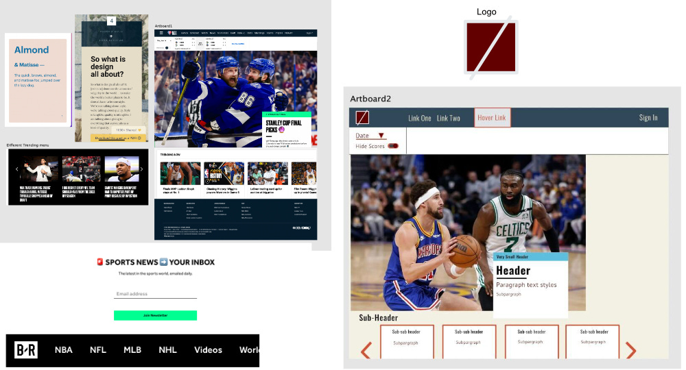
On the left I have a Franken-Tile. A page dedicated to taking elements that I liked from the websites I found to be impactful in the industry. Along with that tile there is an idea for color combinations and typography. There are also some options for other headers, footers, and ways to display card elements.
On the right there is my original style tile that had an ideal way to display the landing page, cards, links, and hover effects. I made a pretty simple logo to emulate the presentation that Bleacher Report’s logo also gives.
Coding:
The HTML was a simple layout that used PHP to populate different modules and incorporate each one into its own file with its own dedicated CSS.
To this point I have been using my own boilerplate but not something this detailed, it took some time to get use to finding elements and how things were organized.
My first run through was a very rough draft of trying to get some of the most impactful elements of the websites I was viewing.
Big landing image
Cards with a on hover text box
Black and white with a notable color and a darken version used sparingly
Looking for feedback:
Hovers didn’t match that represented by Bleacher Report
Insert logo
Add some extra flair. Edit the HTML to add some slight elements to give more of a professional feel, without disrupting the initial layout.
Call to action sections needed WORK. Add some depth and theme to them.
Got a lot of positive comments on my cards and the hover effect… unfortunately I got rid of them because they didn’t match the style I wanted to achieve and thats okay.
Footer is nothing special.
Post-feedback and “Final” version:
Live site : JesseDevs.info
Code: GitHub
I believe this version is able to capture more the feel that Bleacher Report.
The header has an almost identical structure and hover effect.
Added a small section to separate the landing image and the call the action section.
Added images to the call the action modules and darken them to make the text stand out.
Article structure looks very inline with the inspiration.
Footer has some more character.
The content wasn’t fully developed but the purpose of this challenge was to capture the design and feel.


