

Read Before Audio…
Or don’t.
Big thanks to Descript. I was able to get my audio, adjust it, and get a transcript. Keep in mind this is my first time using such things and I erased some normal speech space that I couldn’t really figure out how to get back. So if something sounds a little awkward that would be why.
I had a lot of fun doing this format. Below I will share some images that I talked about in my post.
🕵🏼


NBA Soap Opera:
For the title this week, if curious:
Transcript:
Hey, I wanted to do something a little different this week. Podcasts seem to be. All the rage. When some of your favorite basketball players are all starting podcasts even while also playing the game currently and then there are YouTubers or public figures also doing their own podcast, which don't get me wrong. All farms are. Entertaining. Because you get a deeper perspective. Into something. You only had an outside view.
I think that's what kind of inspired me to kind of do a voice-based blog post. I thought it'd be pretty great and I'd find I found the podcast to be nice to listen to in the background when I do other things, whereas maybe reading a blog post sitting down. Isn't the most efficient sometimes.
I'm wrapping up about two weeks here. It feels like sometimes we were not really doing crazy things, but. They ended up feeling like they were a lot more impactful than they really are. I, we started off making a boilerplate. Which, it's basically a template. For our code. So if I ever start a new project, I'll probably start grabbing this boilerplate. And use that as my starting point. I think about the boilerplate. What do I want as my template? What do I want as a starting point? Those were all good questions. I think the big thing we started with was our CSS sheets. Made sure we had a reset. And then some simple styling that we're probably going to use across the board. And then we linked those into one base CSS file.
I mean the way a Derek says we could. Probably make a CSS file for just about everything if we really wanted to, but then we'd just be making files on files on files. I think that might defeat the purpose. At that point, you might just end up making the same website. Everywhere. Right. I kind of had a fear that I was doing that. Or was being influenced to do something in that way. Because, oh, this method seems great. And maybe I should follow it all the time. But there's always an opportunity to be creative and try to do something different. I think I find a lot of inspiration there and try to push boundaries myself. Into an uncomfortable spot in terms of artistic approach.
We started using the tower. And tower's a way to connect with getting hub so we can have version control. We didn't go too. In-depth into it. It was a big introduction, but from a simple understanding, I think. It just allows us to upload versions. Or of our projects. Maybe I liked my previous version or maybe I liked something that I did two versions ago before I saved over when I'm chair made some changes. It's helpful to keep track of those things. I guess it also provides a timeline. Where he started and revisions, you went through. To get to this point to get to a newer point that we're at right now. I'm looking forward to using more. I do use it with my projects or some of my local files. And trying to keep things updated there. And committing things that way I can keep control of my versions.
A big focus this week was design art. As I mentioned earlier in the boilerplate, we talked about creating a lot of different CSS files so we can use them in this boilerplate. It's helpful to just put the recent into its own file. Why should I have to copy-paste that every time? Right? It seems like a waste of space and maybe my time because my time is valuable. So I should make the most of it.
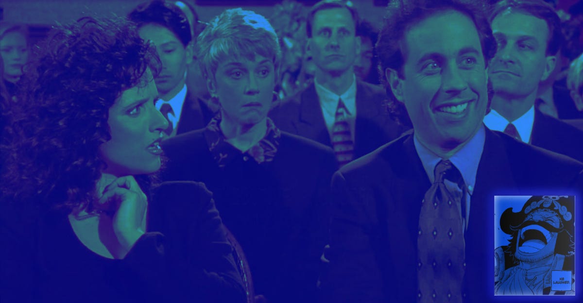
Blend mode. I learned about blend mode in affinity. How we can use colors to transform images into things. They probably weren't before. Below I'm going to post. A picture of the one I shared with my group. I dunno, I was watching a lot of Seinfeld at the time on Netflix and I was getting inspired. And I thought it'd be funny to paint them blue. The craziest thing is that you could actually do it in CSS is probably a little more challenging then affinity but it can be done. And that's cool.
Obviously, I like the creative artistic perspective. And stuff. So being able to just, Hey, let me throw on a little shade of these colors onto something. I think it can level up a design in a sense. Something I've been doing when we usually. Get opportunities or lessons to mess around in affinity is. It's play-around opacity. I just, I just like messing around with the lighting of things. I think the lighting of colors is probably one of the most interesting things about colors and I think a. provides density between images and It just gives the whole art piece more depth.
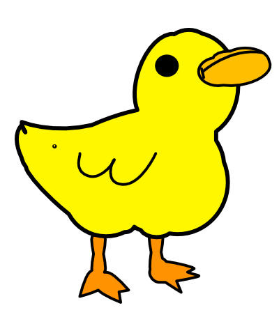
The biggest thing I think we could take from this week was creating SVGs and how to use them in our projects. So an SVG is a sensor, scalable vector graphic. What that fancy word means is that no matter how much I stretcher. I mess with the image. It's always going to hold its shape and it's never going to be pixelated, no matter how much somebody comes in. So it's pretty good to use for a logo specifically. I was thinking of away. Try to use an SVG shape as kind of like background and maybe put an image in there. But I was struggling with that. And maybe in hindsight, as this is an opportunity to. Ask a question. Maybe build my knowledge there. But from what we did, we were kind of making a little logo.
In my case, I made a duck.
The coolest thing about SVGs is if you make the SVG properly. You can control everything about it. So below I'm posting the duck, but I'm also going to post the video. A screen recording of me messing. With the SVG. So I can change every little detail about my SVG right there in my CSS. Which. I feel that the more power we give to our CSS. The more power control we feel we have and feeling control makes us feel. Good about ourselves. I think. So SVG seemed like a really powerful tool to use in this sense. Also freedom of like changing color on the spot. Oh, you don't like it. The logo design or colorway, let me try something new and I don't have to go and remake the whole logo all over again.
We took an opportunity to fill in some gaps. I believe it was Sundays ago. Do some, do some research, do some intricate review on some projects who maybe did. Alrighty. So that's what I did. I was looking on dribble and I found a couple of things that I thought were pretty cool. I started thinking of this design for a website, or maybe even like a portfolio-type thing where you click may be an arrow on the side and it opens like a book. And you kind of get a description. And then the next page. Image. I think it'd be a cool concept. I'm not saying it's going to be the greatest thing ever. But I think it's cool. Something different. And I like that. If not that I was thinking maybe something Like a scroll like you click down a down arrow and then it kind of rolls down. Opens up the next section. This sounds like nothing too crazy but thinking about how I would code is another story. Cause I don't really know how I would first approach that. Along with that. I took some time to go over my client project. I had met with with Derek and we talked about my project for PE. An hour and a half or so. It was, there was a lot of knowledge, there was a lot of things to pick up on. I was afraid I missed something, but I think I got most of it. Yeah. Most of what I think I could have got from it. I see The lessons we're getting now. Actually touch on some of the things he's has spoken with me about.
So just organizing better. I feel on my first run through of my project, I got a little sloppy. Trying to make things work and although it came out and it worked properly in a sense. I know behind the scenes, that was, it was sloppy code. And I think that's where he kind of taught. This idea of starting with how it would look on a phone. And most people are going to open this link on their phone anyway. Right. And I always thought like, no, let me design the whole desktop site and then work my way down. But. There's definitely working on this project. To give me. The perspective I needed. To think, okay, let's start from the phone and work our way out because it might be easier that way. Or at least it feels easier to tend to CSS that way.
So through that, we were able to like work through some. General stylings we could apply to everything and it basically reduced my code by over 200, maybe 300 lines. So that was something I took some time to do a dedicated some time to redoing my project. I mean, I took pretty much everything I had and kind of just reformatted it in a way. That way just, it just loaded better. It looks better. It looked a little cleaner. I know behind the scenes, it's a lot better. Even though it may look almost the same. I could post that link to. Maybe if you're interested in seeing it. If you didn't catch it in my previous post.
Another thing we talked about in the following week is a Flexbox boom. The next box. Crazy tool that helps us plan layouts and organize things. Everything's a box, but it all stacks on top of each other as a column of Flexbox letters. May things into Rose Mason, Mason allows us to space them out. And through this, we can make. You know, some intricate headers and layout. And responsively that's too. I feel a little I don't know, bad because I was using Flexbox in some of my previous lessons and project. I feel like I was using it to kind of learn and like push myself to do, to use it. Cause I know it's, I mean, I think it's pretty important. And I wanted to do it right. That maybe I shouldn't. Having just waited. For the lesson that come up. Because I do feel like I cheated the system in a sense. Because it's something I had heard of and I didn't really, I wasn't great at it. So I wanted to get better. So there's positives and cons to working to what I did. I think. I don't necessarily regret it, but. I do feel I came out stronger with Flexbox now. That I used it. And I think I know how to make. I know how I would make my projects without it too. If. If I couldn't use it. So, maybe I'm playing devil's advocate here and trying to cut myself some slack. But yeah.
We did a lot of Flexbox exercises. It was about two, two last two days. Exercises, the video videos were really condensed too. Pretty well explained and everything. I liked that things were kept very simple. Hey, we just need to know how we display flex things. So everything. It goes into a row by default. There's a lot of Code that doesn't show up when you're coding. Because it's default. So it's nice to know what the default setting is, so that way you can change it. Like I didn't even know that the default, when you do this, They flex it for our line. Items is stretch. And then we, we use justify content to be able to space things out or center to them. And that you could do a lot of things with that. I think something I didn't realize was. You could just space create space between two things that you flags and that automatically creates a pretty nice looking. Header. Or simple header. That's something most sites use like on a mobile viewing and it's responsive because as you make it bigger, It's still a maintains a space between those two objects. So. That's like beyond useful. And I didn't really think of it like that. I thought of it more Flexbox was going to put them into rows and then I, I just manually space them out. But. You know, I've I keep learning and learning. And gap. Using gap is super cool and useful. You create this space. You create a gap. However big you want. And then whether it's a row or column, it's going to maintain that space between the objects. I found it to be pretty useful in my project. When. When I had the front page welcome landing. Action links. That way they get spaced out horizontally, but also space out vertically when on a mobile viewing.
Going to post some things. We did some of my code pens. We're about Flexbox. And building something responsive. I had a big aha moment when Derek sent me a challenge after I had already completed the lesson of adjusting my boxes.Suddenly I had done was. I had my regular layout. A layout with a minimum with 600 pixels. So when the website, where to get to at least 600 Pittsburgh pixels, it would change to this style. And then I had another layout. That would change once it got to 900 pixels. And the challenge was to build it one block to fill its entire space or a hundred percent with and then the other three to share the bottom. It was pretty simple at the 600 pixel. I was able to do that. Simple enough. The problem I ran into was when I got to the 900 pixel version for some reason. The a hundred width. Element remained a hundred width, and I couldn't change it. And I'm stumped for a good 10, 15, 20 minutes, maybe. I noticed that the element was inheriting some of my values that I placed from the 600 pixel media. Where are we? I set up.
And that's where I started thinking, okay. Maybe if I adjust this and some of it will work, but. I couldn't get it all to work together until I cap my responsive media query. So between 600 pixels at a minimum with a 600 pixels and a maximum width of 900 pixels. So when the screen is between those two spaces, this is how it's going to react. And then beyond that it would react this way. I think what I failed to realize was 900 pixels happens to also be bigger than 600 pixels. So.
They would share similarities. So I had to place a cap on that. And that's something I hadn't done. Yet. So realizing that really kinda. You know a little brain fart kind of thing. And when we really think about stuff for future things, maybe I could be more creative with that in mind.
We talked about topography again. Type biography. How important is topography? Something I took away from that lesson was about how trying to be distinct or even creative. Can be really jarring for a reader. And can make it difficult for the reader to properly get your message across. So you have to be careful with that. And also if you don't use proper type biography, You're again, running into the risk of the reader, not even being able to understand or have difficulty with and therefore give up on reading whatever you want it to get out. I think that might've gotten in to some of my thinking into why I want to do more of a talk podcast, blog posts. But podcast type thing. Regardless. I would love to have a transcripted version of everything I'm speaking on here, but I think giving people an option to just have an audio and maybe listen to me. Rant about. Perpetual education lessons. For 30 minutes or something. Maybe that could be entertaining. Maybe it takes something from that and opposed to not being scared away by some texts on a wall.
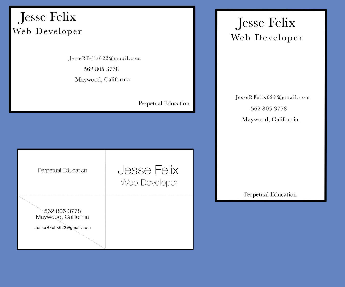
We made some business cards with select serif and sans-serif type font. I'll post those below. I don't really love them. I do like how Helvetica Neue looks. I really liked that actually font is really nice. I don't really know how to describe how it makes me feel, but when I see it, I feel very. I think I like being in control. So it feels very in control. In line. And Coleen innocent. I think a word I like to use clean when describing something. Meaning it's simple and very easy to understand, and you get the message across. So that one probably would be my favorite of the business cards I made.
We talked about CSS positioning. You know, you, when you're Googling how to do certain things, oh, how do I put a. Header to get stuck at the top. Have a screen or how do I move this div or image to be somewhere. You Google it, you get into these form or a message boards. They give you so many solutions and some of them happened to be about position. Oh, Positioned relative position. Absolute. Position fixed. And I would see those and I would have no idea. How to use those properly. Fixed a simple enough, I mean, it's a fixed position, so that means it's not going to. Move anywhere from what you put it. Absolute and relative, or the weird thing for me, I just couldn't. I don't know. I couldn't understand why or how. How those worked. Some really grateful for this lesson. It really made it clear. What and how to use those and like absolute. I mean, the description of absolute on the internet is horrible. But it takes its absolute position. So you can move it around the screen anywhere, but if you make your parent element that it's inside of relative, you could, you can control it within that element. As opposed to it being controlled in the body. It practically looks like a fixed element if you don't lock it in to another element. So. That's something. I think a big thing is just seeing these in the wild and like, How to use these and where. Could they provide me value. But shout out to Steven and the group. He posted a home Depot. They have a little live chat all the way at the bottom. And I've been on that site and I've noticed that, but I never really. Connected the dots on that. Oh, that's actually a fixed position element right there. So we've got some practice with that. I'll post a screenshot of what I did and my. In a code pen. Just so we can see what a different. Positions can do for your screen. And. Hopefully we get to use those more and see what we can do with him.
Speaking of what we can do with them. Tomorrow there's a, it's a big challenge to replicate this layout. And I guess we're free to use whatever. So Flexbox and positioning to kind of achieve. The image. That's something I talk about next week. So if you're interested about how I do. Tune in.
At this point, I'm going to transition. And talk about maybe some personal things.
That I've enjoyed. During this time.
I went to see fantastic beasts three. Like Harry Potter, Harry Potter school. I have not loved the fantastic beasts movies. Or JK Rowling for that matter, but. This third movie felt like a good little bow. On this trilogy there's a chance that doesn't continue from this point but I feel the storytelling was a lot better in this one, compared to some of the other ones I do like the action. In the second movie. There were some scenes that really lightened up, I guess. The storytelling. But regardless of that I did a little rewatch before watching the movie and it was. It was confusing. Some, some aspects that are like, how did that even. Alright. I'd like to think sometimes when I watch movies. So when you see weird things happen, it's just you get confused. But the third one was a lot better about it. I will say there's some holes that I felt. I mean, they weren't addressed really great in the movie, but. Yeah, you win some, you lose some there's cool stuff. Wizards. You know, If you enter that.
NBA playoffs is starting.
LA Lakers suck. So they didn't make it. No surprises here. The goat is not playing in the playoffs. I'm convinced at this point that. The NBA is just a soap opera for sports fans. There's drama every day. On NBA, Twitter. I mean sports writers, Twitter. Somebody saying something, somebody's doing something, somebody having an opinion of something. And fans eat it up. And give their own opinions on that. And it's just an ever going circle.
There's this YouTube video. I recently watched and it's just crazy. The ups and downs. You go into a season following. Your favorite team? They play 82 games. They're not going to win every single game. Unless you're like one of the best teams in basketball ever history. And even then they still lose some games. But it's funny to see. The emotions you feel when your team suddenly wins three games in a row and then loses another seven.
So so if he likes soap operas and you like a ball going in a hole into the, into the hoop. The NBA is just waiting for you.
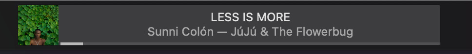
Some Music listening to this week. New Vince Staples project.
I, I mean, I'll be honest. I wasn't a biggest Vince Staples fan when he first, when he was first coming up. Until he started working with Larry Fisher or Mac Miller. Maybe you've heard that name. He started producing for him. And that's when I really became a fan and really enjoyed his style. And since then, he's, he's a. Jobson pretty, pretty great albums that I consider some of my favorite. Working with one of my favorite producers to Kenny beats. I think he makes really simple music, but a, it does the job and allows the artist to. Take it. What do they want? So Vince staples, Ramona park broke my heart. Great album. Recommend, if you have time to listen to it. I think it's pretty deep. Has a lot of west coast vibes to it.
So, if you ever wanted to get some, some of that. Some favorites of mine would probably be when sparks fly, paper cuts, and the blues. I am a sucker for outro tracks that just. Talk about life and like re-evaluating your time. That you spent putting into this project and. And what it means to you and hopefully to the people that listened to it. And I can appreciate that. And I dunno, I feel a connection in a sense where. You know, you, you put in this time and effort into something you just want you want to be appreciated for it?
Thanks for joining me on this. Experiment to say the least. I may do it again. I kind of had fun just talking.
I think that when I'm writing. I get to think about stuff more. And can process an idea better, but sometimes that can derail from how passionate I am or, or how much care I give into something. So being able to talk about Talk about stuff, talking about what I'm doing. I think it gives a different perspective. Post from getting texts off the blog post. I like talking in a certain way. And presenting ideas. I don't know if it comes off that way. But I appreciate if you listen to, as far as I appreciate that I'm going to try my best to get a, a transcript of this. So if this is in the recording, then. Yeah.
But, yeah. Thanks. I'll catch you later. We'll be back next week with a wrap-up of this challenge upcoming and more.
I can't lie every week.
It's weird to say, I look forward to Mondays. But it feels like every week is a start of some big journey for the week that we go through. And the journey starts Monday. So you gotta be ready for it.
