

It's cloud illusions | Perpetual Education: 004
I don't know clouds.

Hey there again!🕵🏼
Oh my… what a week.
Professional.
We got a client this week!… okay not really but had to put my freelancer shoes on and tackle a project in all aspects from start to finish for a ‘client’.
As you could imagine, less information could make it difficult to interpret the vision a client could have for the finished product. There leaves a lot of gray areas for me, the designer to work with. Less information also allows me to experiment and try things that may end up one-upping the imagined version of the website. Pros and cons for both sides.
The project was divided across the week. That’s it. No lessons. Just focus on developing a website for the client based on research, their wishes, and what you wanted to make.
My client information:
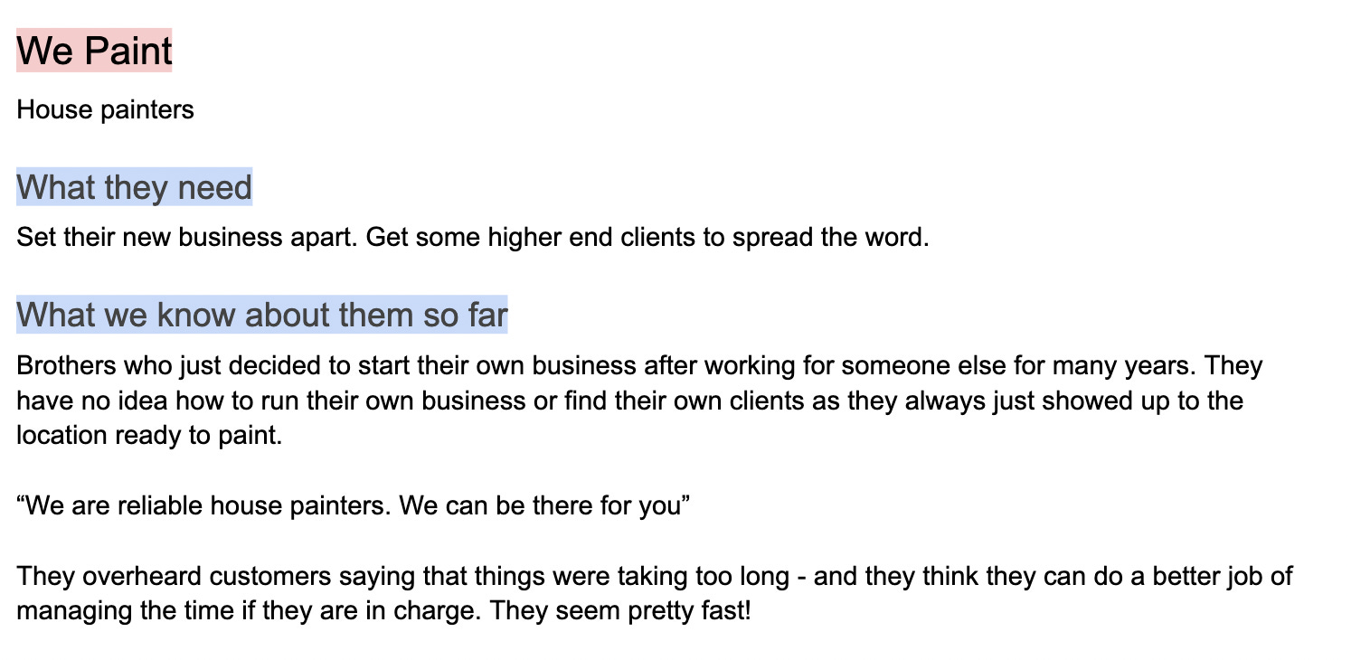
The first day was dedicated to researching. What kind of websites do house painters have? I’ve never looked for a house painter let alone hire one so this business was pretty new to me. After reviewing a couple of sites and recognizing how they ideally structure the information, I took some time to think about how I wanted to approach this idea for myself.
I had to think about what the purpose of my client’s website was and how to make that different from the competitor’s website. So I immediately thought, “why make things complicated? No need to hide information behind other links or pages. Just have everything easily accessible by the visitors.
I took inspiration from the competitor sites to build out the bones of the site but I added some tricks to help differentiate and be a little more enticing for the visitors.

Scrolling through Twitter gave me the idea of having the header on the side and creating links to sections on the page using IDs. You could see my finished header below.
Results:

I ran into the first sign of trouble when I didn’t know how I was going to have the header hang out on the side and have the links spaced out properly.
After some googling and trial and error… I figured out to have the contact number and socials hand out at the bottom I had to trick the site.
.parent {
   display: flex;
   flex-direction: column;
}
This makes the elements in the parent stack on top of each other like a column.
.contact-number-socials {
   justify-self: flex-end;
   margin-top: auto;
The first property will move those items to the end of the column. The margin trick is something we’ve done when wanting to center an inner column inside a section. Placing a max-width and then margin-left and margin-right set to auto will make the element centered, this basically does the same thing but vertically.
Results:

Alright, but how did I get the header on the side like this??
I’m pretty inexperienced with Flexbox. I keep trying to use it to force myself into learning how to work with it… I would like to say it’s working. In the image above I did this:
<body>
   <header>
   </header>

   <main>
   </main>
</body>

body {
  display: flex;
  flex-direction: row;
}
By default placing flex will make things go next to each other in a row. Here I made the body flex so that the header and main would sit next to each other and look cute. All that was left was to give them a width to account for the screen. In this case, I made the header take-up 18vw and the main 82vw. vw is view width which means it’s going to take up 18% of the current size of view width, which means it will constantly reshape without me having to do anything extra.
This way in total they would take up 100 amount of the space.
Something else that inspired me was this scrolling shoe display on the Nike website.

I thought that would be a perfect way to display some completed house projects! So off to google once more!
Actually pretty simple. I sent the images inside divs and gave them a width so they would all align on height and then put all those divs inside of a parent element. On the parent element I:
parent-element.scrollmenu {
    overflow: auto;
    white-space: nowrap;
}
Results:

Maybe there’s a better way to show the scroll bar, but it’s there trust me.😉
Media queries! It’s something we haven’t really gone over in a lesson per se but it has been mentioned. I have some small experience using it, so you could say I’m somewhat familiar with the selector.
This allows us to change certain elements based on screen size. This way the project looks just as nice on mobile as it does on desktop.
I didn’t have to adjust much on the site structure when it came to the mobile view BUT I ended up adjusting a lot of elements because of my messy CSS when designing the desktop view of the site. It ended up biting me in the butt and sending me for a loop.
Results for mobile view:

Hey did I mention I made the logo too! I actually used a free logo generator and then made some adjustments on Affinity to fit a style of my liking.
.Conclusion:
There were a lot of ‘ah-ha’ moments experienced in this project and pretty proud of my final result. It was difficult and learned a lot that I can hopefully take with me to the next project we have.
Link to the site!!!
Here is a live link to the site!
Check it out on any device.😉
Started this new week with a meeting with Derek to go over my project. A lot of opportunities were presented but I think I hit a lot of good marks for my current level. Something that he sparked in me was to work on a site’s view from a mobile perspective, which I didn’t think I would do but he made it look so simple and so clean this way. Oh yeah, and he showed me how to make the bones of my websites in less than 20 minutes… sheeeesh. It was pretty impressive. Looking to get to that level!😅
Personal.
You’ll want to read this one, I think.
It’s no secret that I like to quote something I’m watching that sparked an emotion in me. This week was a little different. I couldn’t think of what to take from, maybe I’m not watching enough new things or nothing hit me in a certain way to leave a mark.
Although, I say I had a difficult time with that I presented today’s title from a song covered in the movie CODA. The gist of the movie is the daughter of the family loves to sing and is good at it, but her entire family is deaf. They could never hear their daughter’s voice. The situation forced her to go through struggles that someone of her age would never understand and take more responsibility than she ever thought she could.
If I could describe this movie in one word it would be ‘beautiful’. Okay, maybe ‘heart-warming’ too.
There is a heart-crushing scene that I won’t spoil that gave me a view I don’t think I would be strong enough to handle in that position. There are people with disabilities and challenges but it doesn’t mean they aren’t strong people.
Something I’ve taken note of from working with Derek is that he is very conscious about his decisions when designing and developing to make sure he can accommodate those that require accessibility features. I’ve experienced working to solve an issue on a blind man’s phone. I’ve never interacted with someone who possessed a disability but still was able to use technology like you or I. It made me feel grateful for the accessibility features that are created in this generation to make this moment happen.
This movie just shined more light into the work we have to do as people to continue evolving. Derek’s teaching has gone beyond simply designing or coding but also creating moments for people. It has influenced me to keep an open mind for something that may seem simple to me but maybe not so much for others. I hope you can take that from my post and maybe your own journey.
Clouds look like they are there blocking the valuable sunlight but we also have to remember the imagination they inspire in individuals. Both sides are important.
Thank you.
🌤