Creating an app. | Perpetual Education: 011
To elude a storm, you can either sail into it, or around it.

THE PURPOSE -
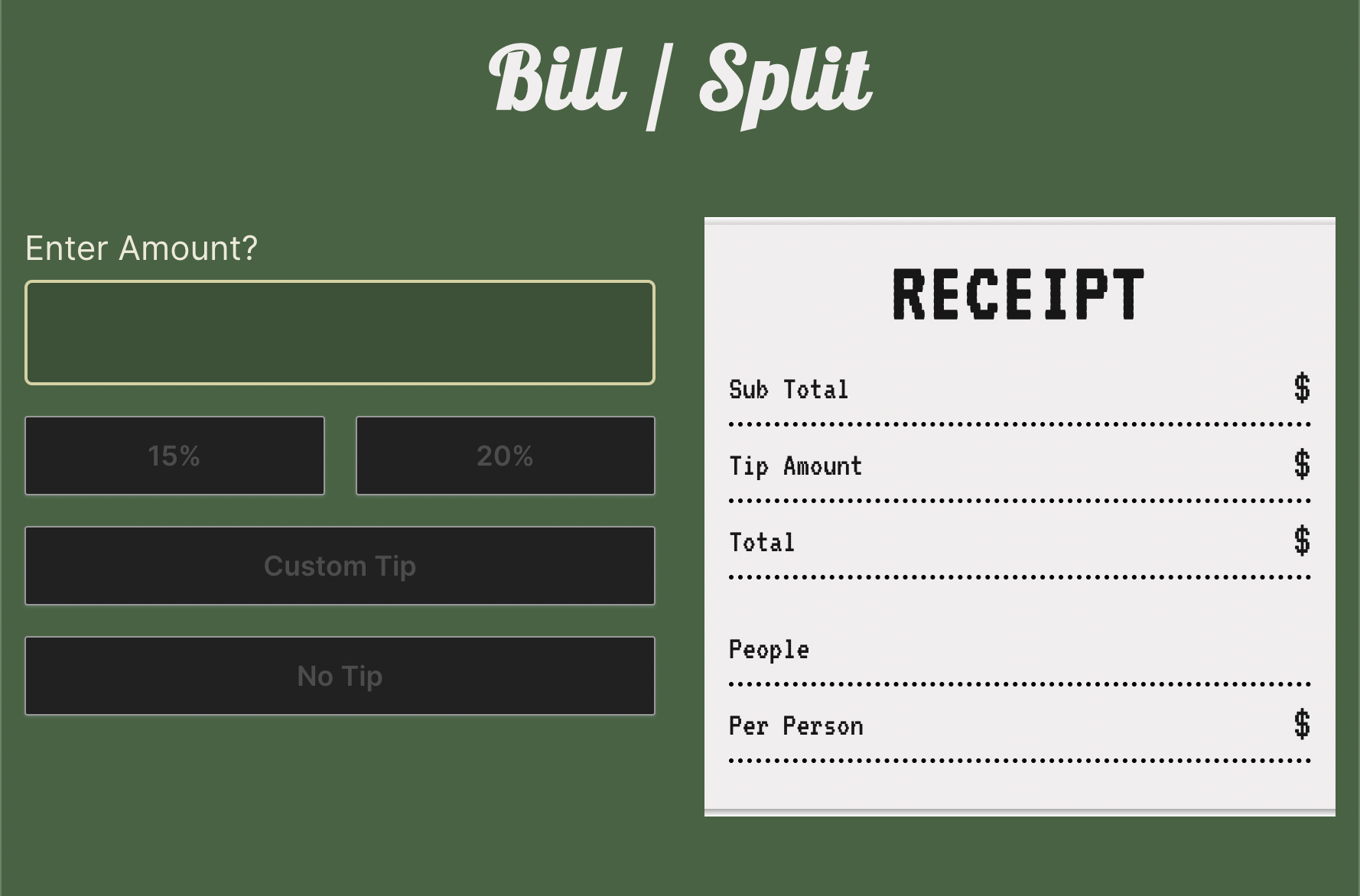
The goal of this project was to get myself and others away from a calculator app when the bill arrives at the table. This app would be a one way stop to gather the total amount, take the tip and then check if you’d like to split it amongst the group. Javascript provides the buttons with capabilities of loading new template pages to the output box on the landing page, to create a seamless experience for the user. In addition to loading these templates, create functions that will calculate all the necessary math and display it to the user. Present all the information to the user and keep it simple, understandable, and frictionless.
THE GOAL -
Look into bill sharing projects.
Create a layout of “pages” that would be the ideal path for the user.
Turn the layout into template variables in Javascript.
Use “data-route” buttons to guide the user down the path to calculate information.
Figure out what calculations are needed to present all information to the user.
Create functions for said calculations and how to output them.
Organize variables for output fields, numerical amounts, and items to click.
Stylize app to make use of some new little tricks to display cool techniques to the user.
THE APPROACH -
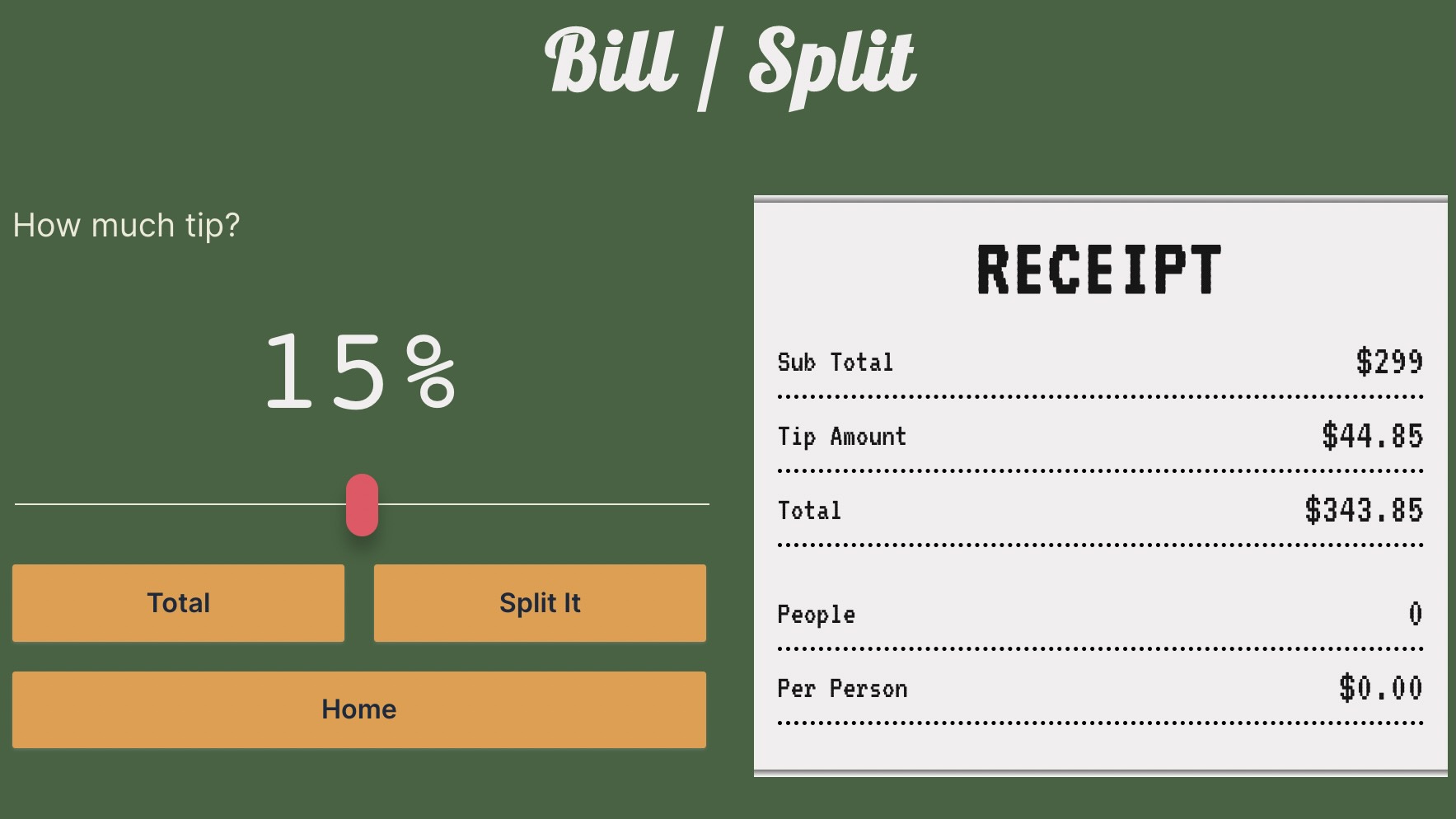
I started with the idea of making different templates that would represent the pages that would appear on the app. When I thought of the idea, I led with a homepage that would allow an input of an amount - ideally an amount that you receive on a bill at the table. Next, I wanted to lead the user to a tip page. On this page the user would scroll to select the percentage of tip they would like to add to their meal. I chose to make a slider range value input because I thought it would be interesting and give me the opportunity to use Javascript to grab the value and live update the amounts on display. Finally the page would appear where they have a total and could decide to split that amount among a number of their choosing. Initial idea layout was drawn up in a Figma file that would replicate the users pathway on an ideal interaction.
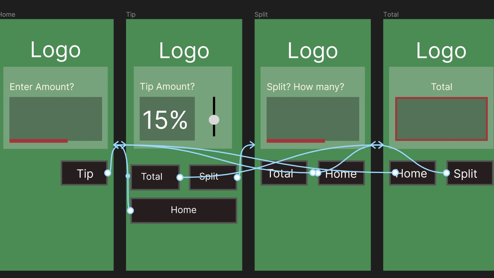
An initial challenge was setting up buttons so that they would route towards a specific page but also make them take the input and show calculations. I had originally set up an event listener on the window that was looking specifically for clicks and if those clicked items matched a “data-route” that I had set up. I soon learned that I needed an additional set up to listen for an input so that I could grab the value. When the input value is entered it then displays it for the user to see live changes to their amounts. Okay, but now I need to be able to make calculations on the clicks. I revisited my initial set up so that it could listen for clicks on buttons ID classes to then do the appropriate function.
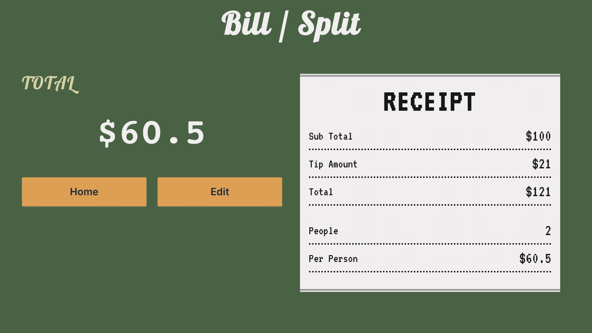
I worked through some blockers and was able to build the base version of my app that accomplished the goal I had set out at the very beginning. Take an amount, calculate a tip percentage, split it by an amount of people and share the amount to the user. I decided to work on some styling at this point and this is a way to present the information to the user. Well, making a bill splitting app made me think of a receipt you receive at the end of an outing. I made an element and designed it with the idea of representing that very receipt that would then show each item the user is processing though as they follow the data path. Now that some style is in place, the information is displayed to the user, and the base path was set up, it was time to get some feedback to see some paths I may not have considered.

THE FEEDBACK -
Although there were a lot of positive interactions with the app, there were some hiccups that caused friction in the user's experience or at least made them second guess themselves. A big note was that the input fields were not legible, they didn't seem clickable. To compensate for this I added a border and focus changes when typing a value and made the question in the label element more direct and simple. I took some time to add some attributes to the element so that when opened on mobile, it would prompt a number pad similar to a phone contact.
The input range field was originally displayed vertically because I thought it would be more intuitive for the user to adjust their tip amount but it actually hurt their impression more than anything. Not only was it assumed to be a write in field similar to the other menu but the slider did not read as a slider on the first viewing. That became a key target of interest to fix because it is not the user’s fault if they don’t see what I want them to see, it’s mine. To account for this I added a default value to be presented in the box and returned the slider back to its original horizontal position.
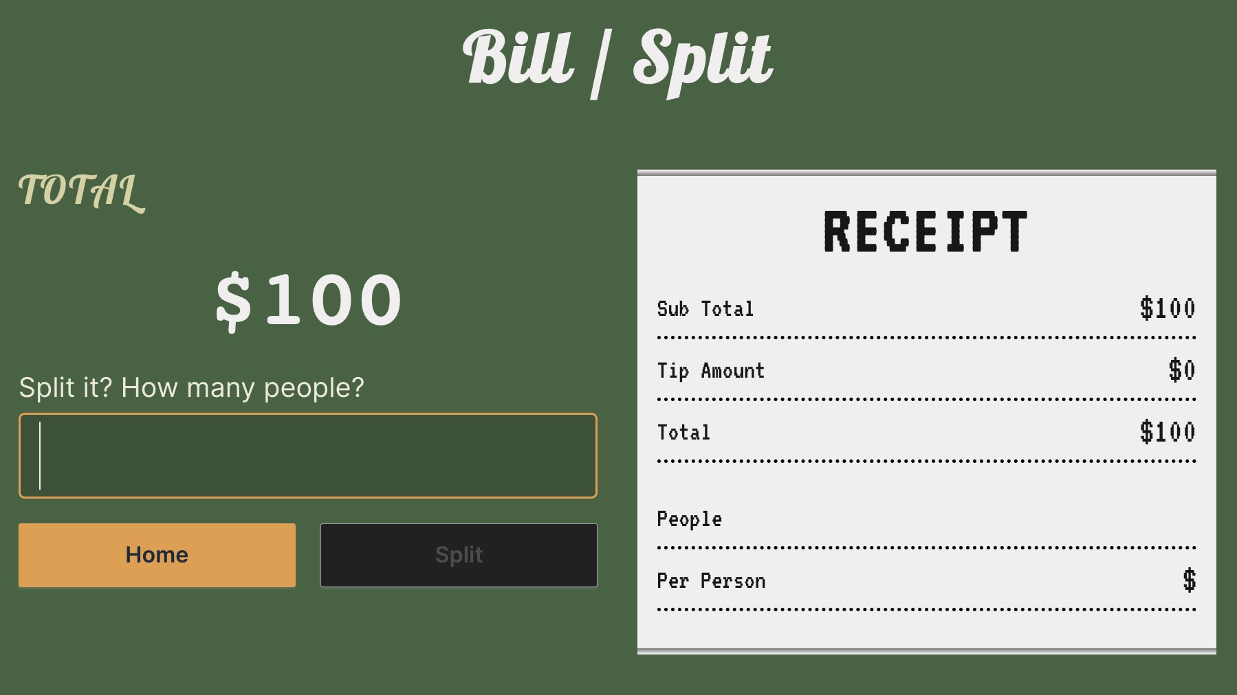
The goal of the site was to be able to calculate the tip for a total but that doesn’t mean a user always wants to tip or give a custom amount. What about a set amount? What about no tip? At this point I reviewed my buttons and tried to analyze more situations the user might go through to give them more options but still in my control. Buttons are disabled unless the user has entered a value, that way there’s no funny business going on. I added a home button on some pages to return the user back to the beginning if a mistake was made. I also added an edit button so if the group were to split the amount among more or less people, they could go back to the total and adjust the amount of people.
THE LEARNING -
I think I tripped myself up on my first attempt at making an app by overthinking the path and interactions that will take place. This project gave me the opportunity to take a look at a simple problem or circumstance and provide a solution for it. This took time to solve all the interworking pieces and functions that would come together to showcase all the proper information. As a designer I also realized how important it is to give the user an enjoyable experience and make it readable to all on the first go through. It is my responsibility as the Frontend Developer to shape an enjoyable, functional, and frictionless experience.
Hey man, impressive work. I like the different typography you used for different parts of the app. Hope the JavaScript is going well!